
06.10.2024 HData Team
As the world takes bold strides toward a more sustainable future, the regulatory energy landscape is undergoing a profound transformation. The shift, of course, comes in the form of greater emphasis on renewable sources of energy.
There’s good news for anyone interested in keeping a close eye on the changes: the public-facing data already exists.
In this blog, we’ll review five key performance indicators (KPIs) you can use to track the transition and we’ll share tips on how you can quickly assess them.
KPI #1: Energy Generation Expense per MWh Generated (FERC)
Overview:
This metric is a measure of how much a utility spends to generate a particular type of energy.
The FERC breaks energy generation down into four main categories:
- Steam
- Nuclear
- Hydro
- Other
“Other” includes a mix of renewable, non-renewable, and low-carbon alternatives (like natural gas).
You can see a visual analysis of this metric here:
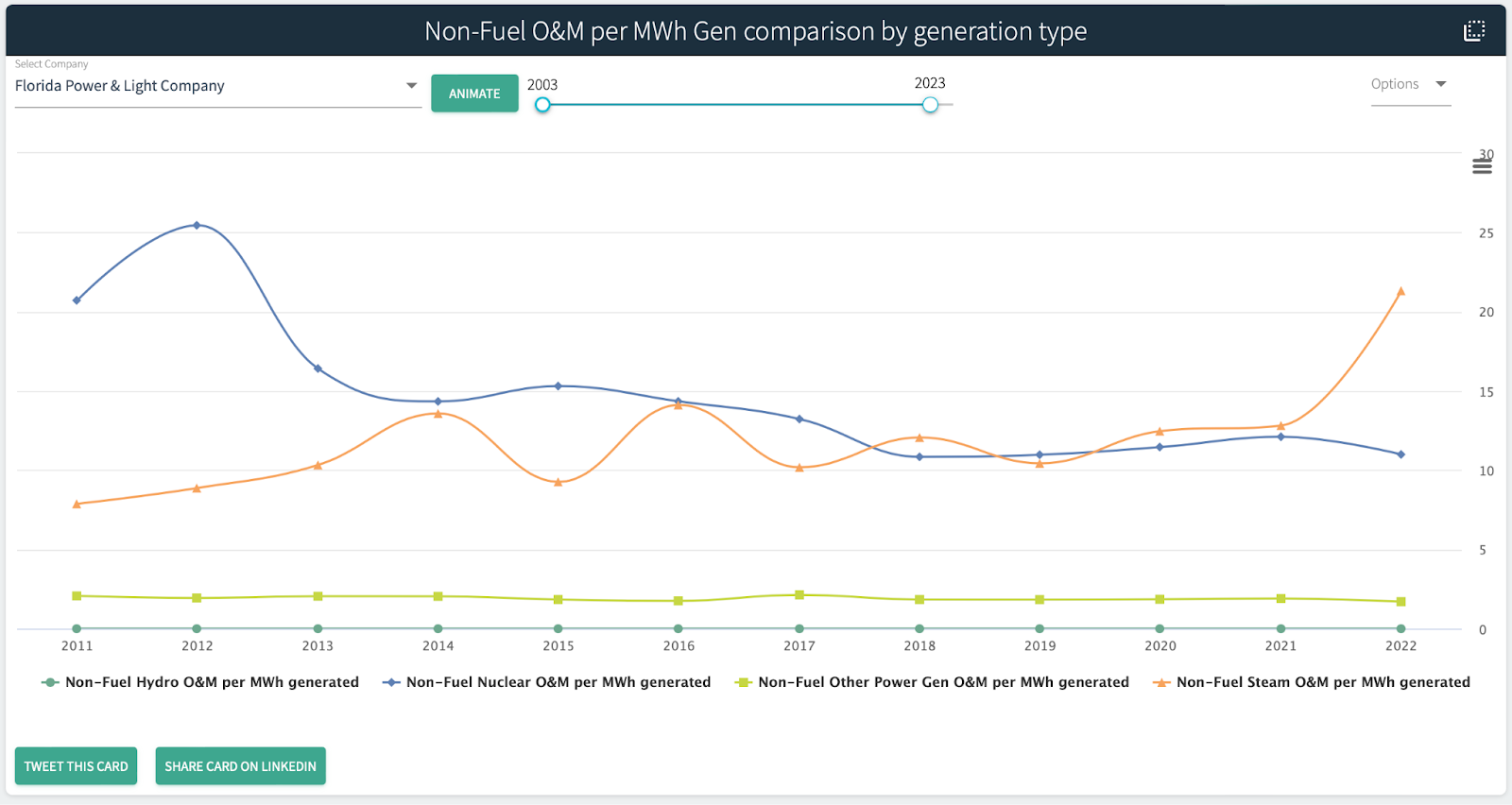
Key takeaways from current data:
- The average expense per MWh generated for each type:
- Steam: $10.60
- Nuclear: $2.73
- Hydro: $12.02
- Other: $4.50
- Nuclear is the cheapest to maintain for every MWh generated (however, initial build cost is much higher than other generation sources).
- Generation of power in the “other” categories is cheaper as well in terms of maintenance for each MWh generated.
- Note that if fuel is included in the expenditure, then the “other” category becomes the most volatile. This highlights the importance of “controllable” expenses vs uncontrollable expenses (like fuel, which is susceptible to market fluctuation).
What you’ll learn by watching it:
Keeping an eye on this KPI will give you a sense of how economical and efficient it is to produce different types of energy. Toggling between the Fuel and Non-Fuel versions of this metric will provide insights (like with the “other” category above) about the role market fluctuations are playing. In short, you’ll develop a perspective on what’s possible to produce at scale for a given cost over time.
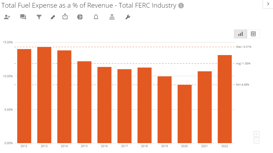
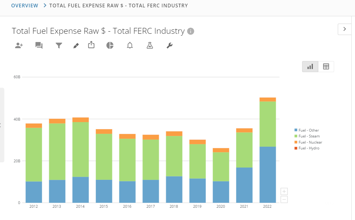
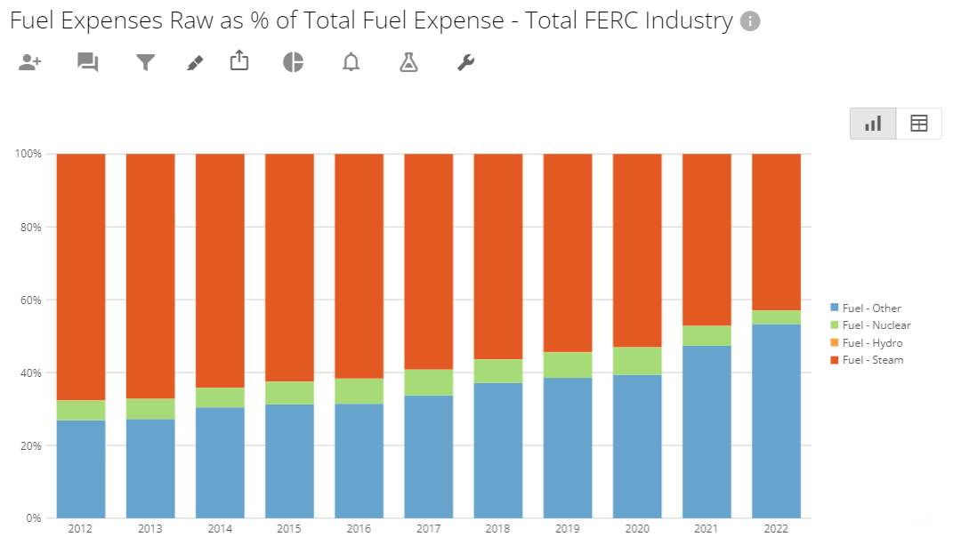
KPI #2: Fuel to Operating Revenue (FERC)
Overview:
Much of the fuel expenses reported in FERC filings stem from non-renewable and carbon-heavy sources like coal and natural gas. (Nuclear is an exception, so it can be subtracted from the total fuel expense. Hydro fuel expenditure is almost non-existent, as are solar and wind.)
You can see a visual analysis of this metric here:
Key takeaways from current data:
- Fuel generat-ed in the “other” category became the most expensive fuel type to produce in 2021 and 2022, due to the cost of natural gas.
- Water used in hydro production is very inexpensive.
- Fuel for nuclear is also very cheap in the grand scheme of things.
- Fuel for steam power generation is still very prominent, but declining as a % of the total fuel expense.
What you’ll learn by watching it:
By tracking this KPI, you can track the efficiency of energy production even in low/zero carbon generation fuel types.
KPI #3: Capacity Factor (EIA)
Overview:
This metric allows us to see how efficient a plant is—how much energy it’s producing in light of how much energy it could possibly produce.
For example: If we ran a plant 24/7/365, what could it produce versus what it actually produced in that same period. Higher % means it gets closer to the constant running number.
Key takeaways from current data:
The Energy Information Administration (EIA) has standards utilities need to meet around the average capacity factor for various generation sources.
Stats from the EIA (2022 average):
- Fossil Fuels
- Coal: 47.8%
- Petroleum
- Steam Turbine: 15.7%
- Gas Turbine: 2.2%
- Internal Combustion: 2%
- Natural Gas
- Combined Cycle: 56.7%
- Gas Turbine: 13.7%
- Steam Turbine: 13.6%
- Internal Combustion: 18.8%
- Non-fossil fuels
- Geothermal: 73.4%
- Hydro: 37.4%
- Nuclear: 92.6%
- Other Biomass: 61.2%
- Other Gas: 61.7%
- Solar: 23-24%
- Wind: 36.1%
What you’ll learn by watching it:
Tracking this metric over time will help you determine whether overall efficiency is increasing or not, and in what categories. Take it a step further by analyzing companies against each other. That will help you determine whether certain policies by regulators are having impacts on their capacity factors.
Note: The new Capacity Factor App in HData is a great way to analyze this metric.
KPI #4: Percent Growth in Transmission Plant Value (FERC)
Overview:
Generating renewable energy is just part of the equation, it also needs to be transmitted. The interconnection queue is a huge policy problem. There are two ways to fix it:
- Build more transmission lines
- Reform the interconnection queue.
The industry has the most immediate available impact in the former.
Stats to track:
We can use FERC data to analyze efficiency in transmission expenditures (i.e., what is the transmission expense relative to revenue?) and to analyze growth in transmission development.
Specifically:
- Transmission Plant Value (FERC Form 1): The dollar value of a utility’s total transmission assets at the time of reporting
- Transmission Plant Additions (FERC Form 1): New value added to the transmission lines
- Transmission Plan Retirement (FERC Form 1): If this value increases, we see old lines being retired and replaced (hopefully)
- Length of Transmission Lines Added (FERC Form 1): This can be combined with other stats to assess effective spend on new transmission lines per added line mile.
Note: The Transmission Line App in HData and the FERC Form 1 data are good places to start.
KPI #5: Utility Reliability (EIA)
Overview:
Reliability is important to monitor as we make a fundamental change to our grid and generation system; cleaner energy still needs to be reliable.
Stats to track:
- SAIDI: System Average Interruption Duration Index
- SAIFI: System Average Interruption Frequency Index
- CAIDI: Customer Average Interruption Duration Index
- MAIFI: Momentary Average Interruption Frequency Index
Key takeaways from current data:
According to HData analysis of 675 utilities reported under the IEEE standard (data from 2022):
- Customer saw on average an interruption of 315 minutes
- Customer saw on average 1.7 interruptions in a year
- Average interruption length of 183 minutes for 2022 for utilities that reported both SAIDI and SAIFI to calculate a CAIDI (this is an improvement over the 331 minute average reported by the EIA for 2021)
Note: These stats are tracked by HData for each utility within the Utility Reliability App in Insights.
Of course, these five metrics just scratch the surface when it comes to tracking the industry’s transition to renewable energy sources. But it will give you a good starting point. From there, you can modify the approach to fit your particular use cases.
Are you ready to start tracking these and other metrics in HData? Register a free account and gain access today.